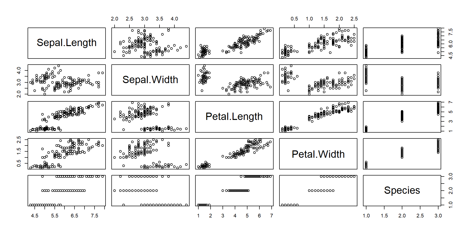
plot(iris)x2-Graphics with R
Applied Statistics – A Practical Course
2026-01-28
The Easy Way
- R contains many graphics functions with convenient defaults.
irisis a built-in data set in R (see next slide)plotis a so-called generic function that automatically decides how to plot.
The iris data set
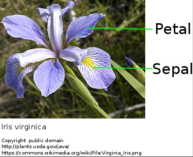
The famous (Fisher’s or Anderson’s) iris data set contains measurements (in centimeter) of the variables sepal length, sepal width, petal length and petal width of 50 flowers from each of 3 species of iris, Iris setosa, I. versicolor, and I. virginica.
- see
?irisin R’s online help. - or: https://en.wikipedia.org/wiki/Iris_flower_data_set
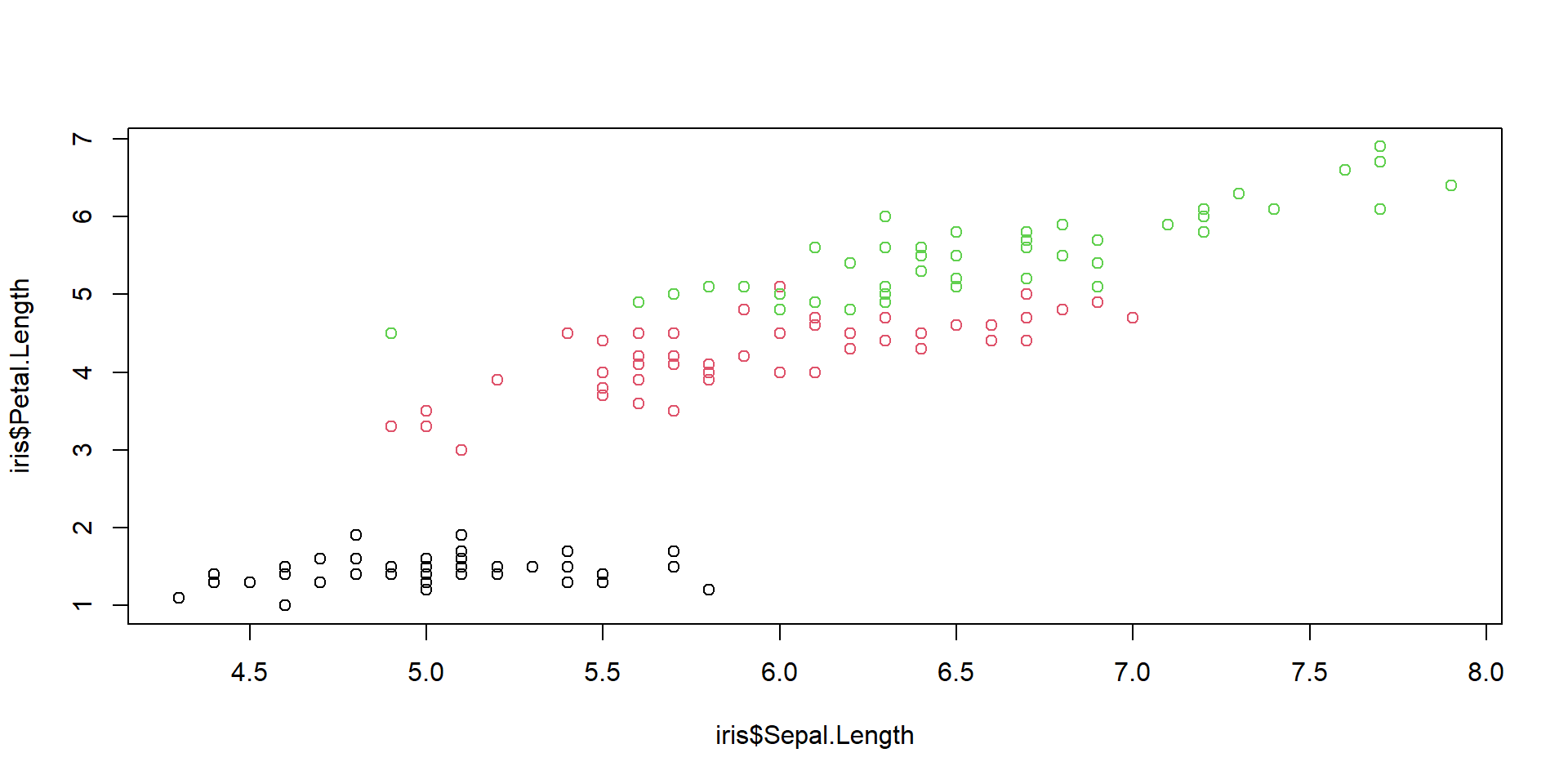
Plotting colums of a data frame
plot(iris$Sepal.Length, iris$Petal.Length)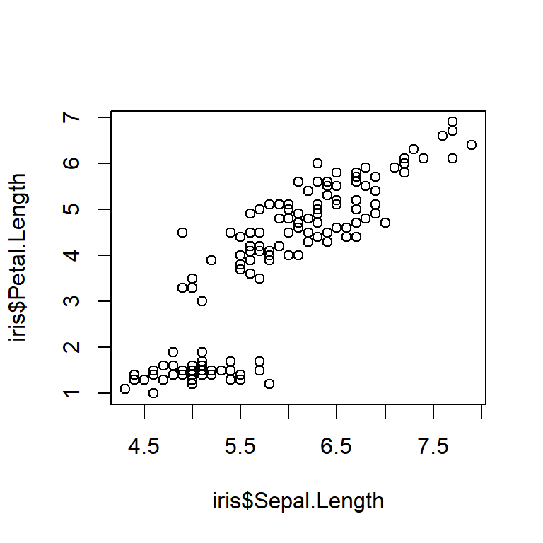
plot(iris$Sepal.Length, iris$Petal.Length,
     col=iris$Species)
A column of a data.frame is accessed with $.
The use of with() saves dollars
plot(iris$Sepal.Length, iris$Petal.Length,
     col=iris$Species)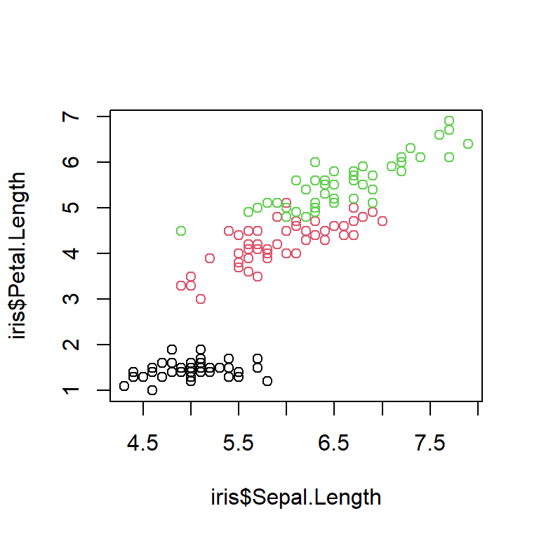
with(iris, plot(Sepal.Length, Petal.Length,
                col=Species))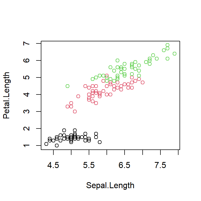
Colors and plotting symbols in R
R allows to change style and color of plotting symbols:
col: color, can be one of 8 default colors or a user-defined colorpch: plotting character, can be one of 25 symbols or a quoted lettercex: character extension: size of a plotting character
plot(1:25, col=1:25, pch=1:15, cex=2)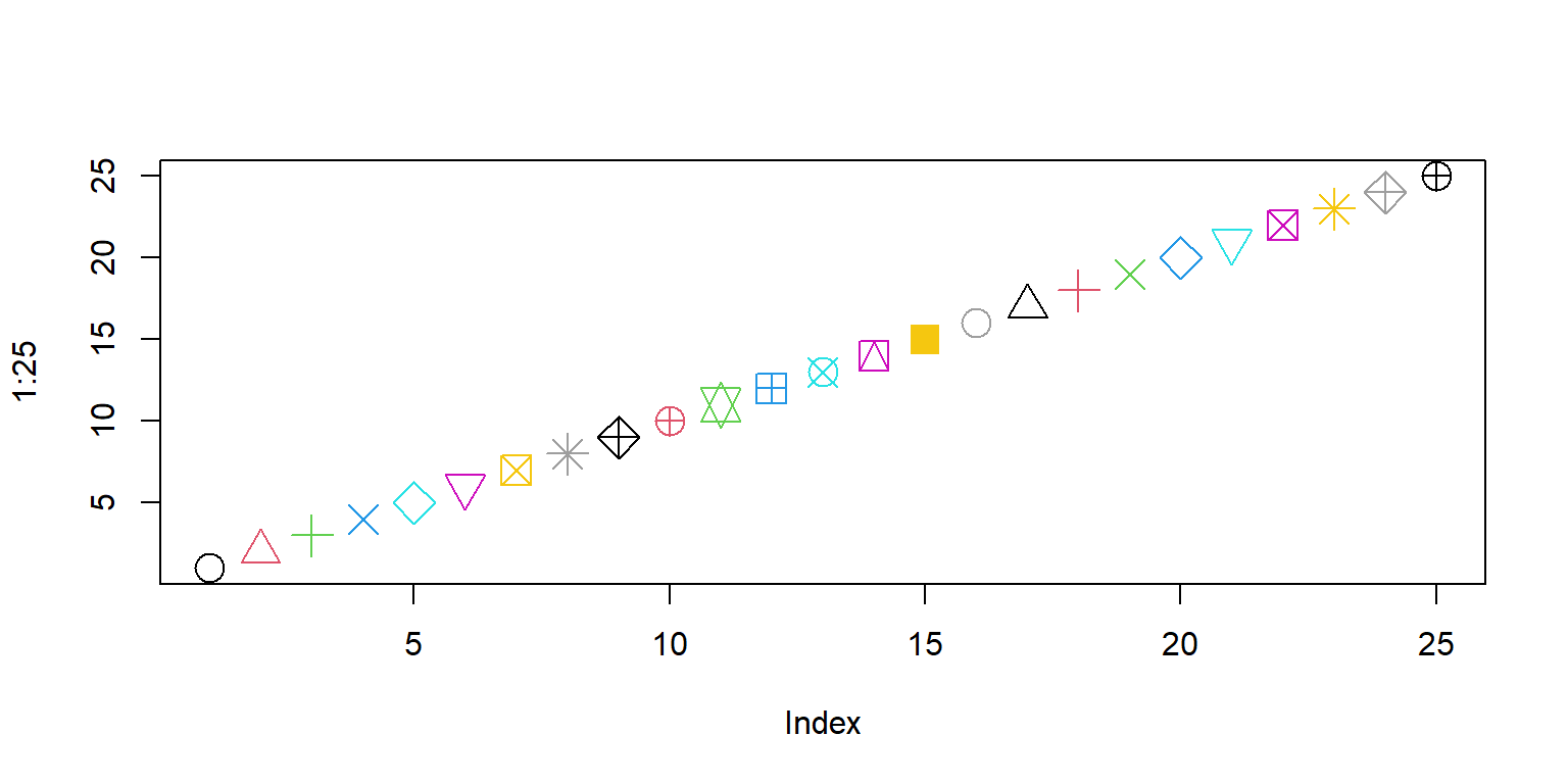
Special plotting symbols
- symbols 21..25 have an optional background color
lwd: border width of the symbol
plot(21:25, col="darkred", pch=21:25, cex=2, bg="green", lwd=2)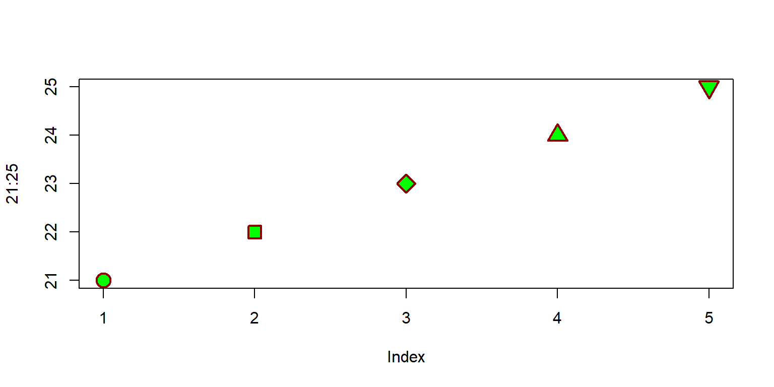
R as function plotter
x <- seq(0, 20, length.out=100)
y1 <- sin(x)
y2 <- cos(x)
plot(x, y1, type="l", col="red")
lines(x, y2, col="blue")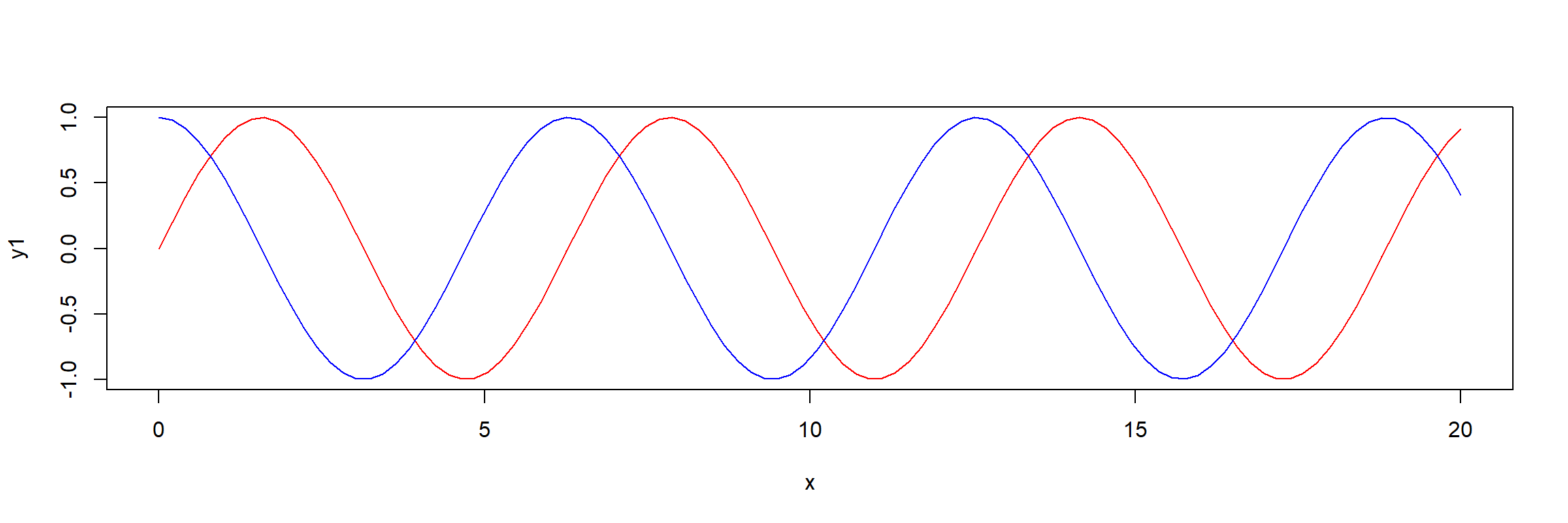
- type: “p”: points, “l”: lines, “b”: both, points and lines, “c”: empty points joined by lines, “o”: overplotted points and lines, “s” and “S”: stair steps, “h” histogram-like vertical lines, “n”: no points or lines.
Line styles
x <- seq(0, 20, length.out=100)
plot(x, sin(x), type="l", col="red", lwd=3, lty="dotted")
lines(x, cos(x), col="blue", lwd=2, lty="dashed")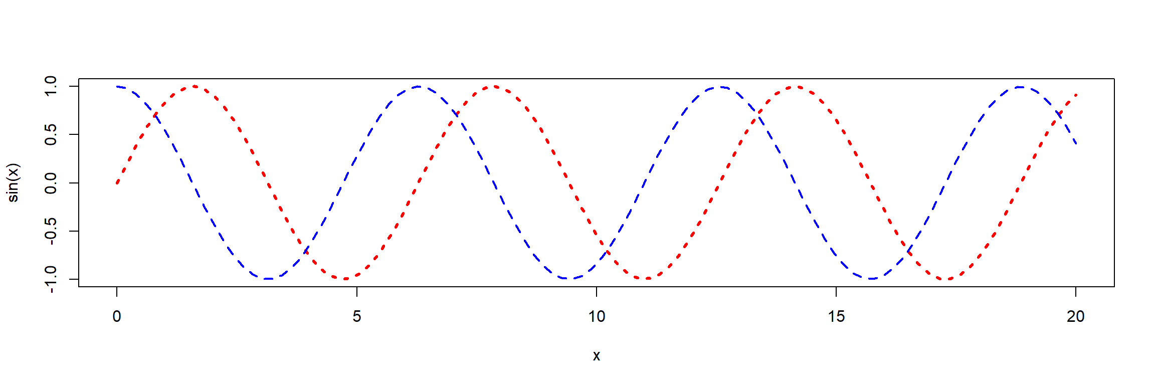
lty: line type (“blank”, “solid”, “dashed”, “dotted”, “dotdash”, “longdash”, “twodash”) or a number from 1…7, or a string with up to 8 numbers for drawing and skipping (e.g. “4224”).lwd: line width (a number, defaults to 1)
Coordinate axes and annotations
plot(iris$Sepal.Length, iris$Petal.Length, xlim=c(0, 8), ylim=c(2,8),
     col=iris$Species, pch=16,
     xlab="Sepal Length (cm)", ylab="Petal Length (cm)", main="Iris Data",
     las = 1)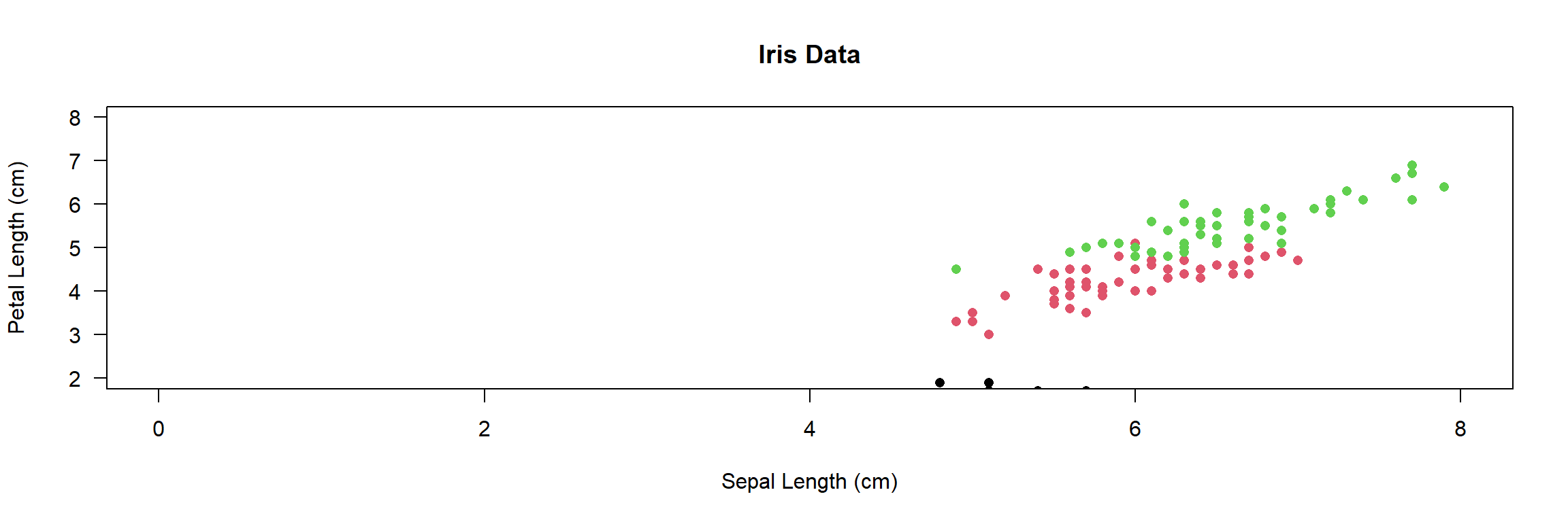
col=iris$Species: works becauseSpeciesis a factorlas=1: numbers on y-axis upright (try: 0, 1, 2 or 3)log: may be used to transform axes (e.g. log=“x”, log=“y”, log=“xy”)
Adding a legend
mycolors <- c("blue", "red", "cyan")
plot(iris$Sepal.Length, iris$Petal.Length, xlim=c(0, 8), ylim=c(2,8),
     col=mycolors[iris$Species], pch = 16,
     xlab="Sepal Length (cm)", ylab="Petal Length (cm)", main="Iris Data",
     las = 1)
legend("topleft", legend=c("Iris setosa", "Iris versicolor", "Iris virginica"),
  col=mycolors, pch=16)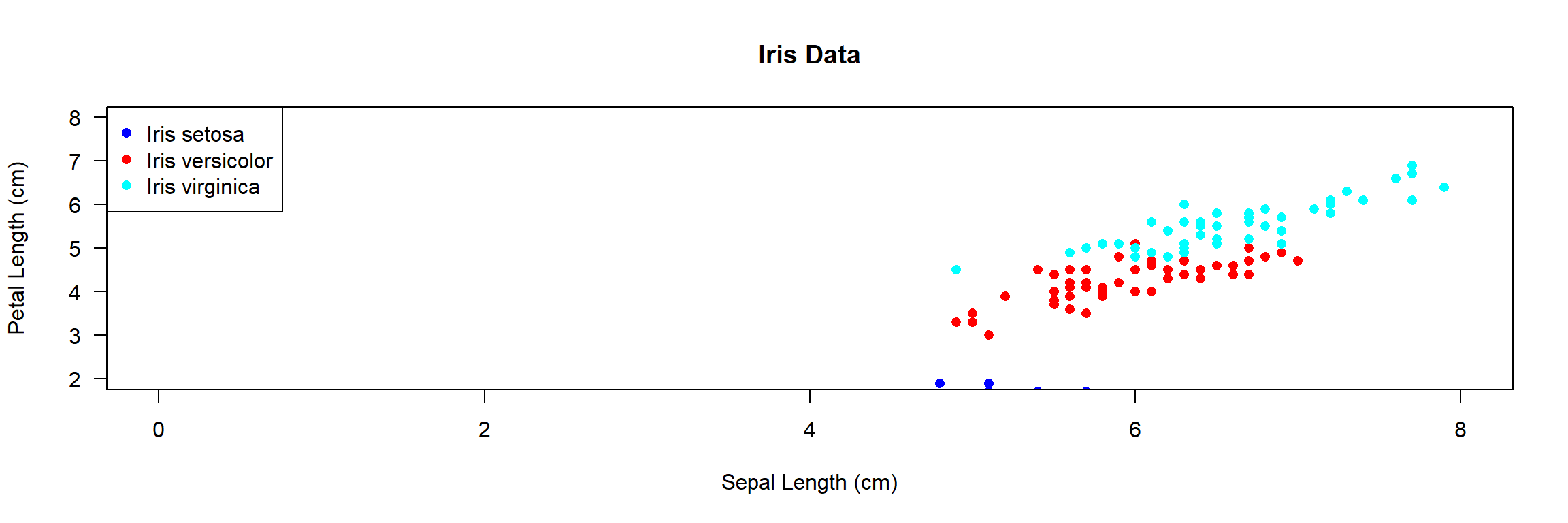
- see
?legendfor more options (e.g. line styles, position of the legend)
Example
#
plot(iris$Sepal.Length, iris$Petal.Length,
     col=iris$Species)
#
opar <- par(cex=2, mar=c(4,4,1,1), las=1)
plot(iris$Sepal.Length, iris$Petal.Length,
     col=iris$Species)
par(opar)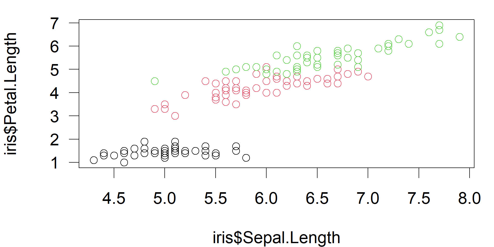
- change font size (
cex), margins (mar) and axis label orientation (las) oparstores previuos parameter and allows resetting
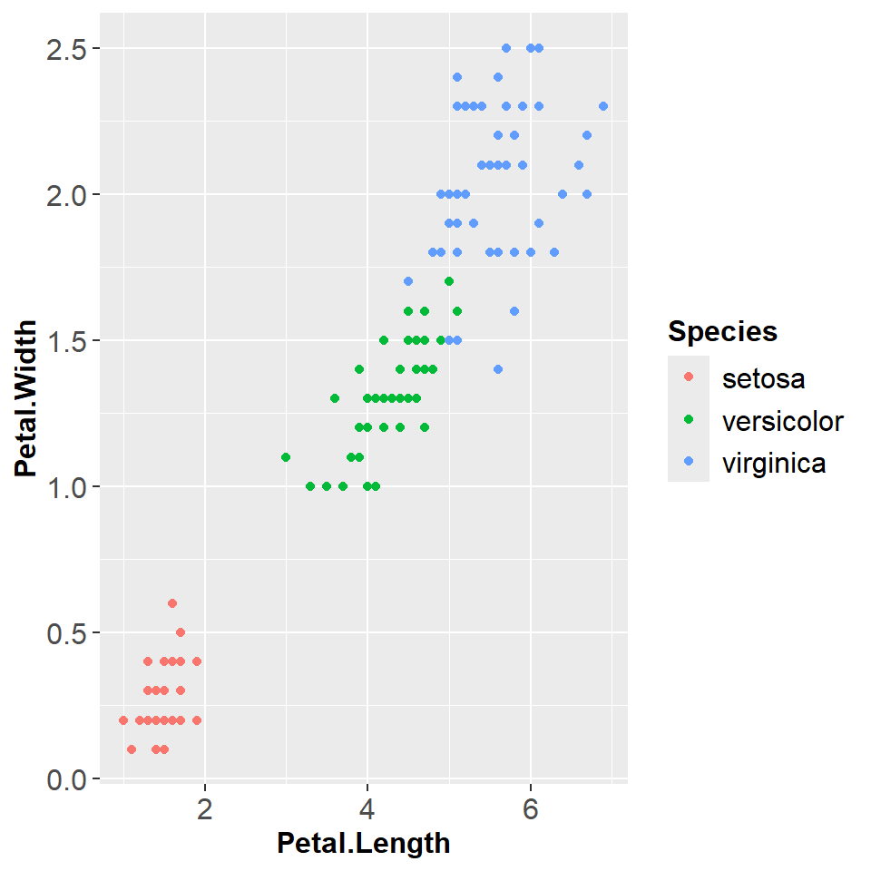
Font size of ggplot figures
- Appearance and font sizes of ggplot figures can be controlled with themes.
- It makes sense to create a theme separately and then add it with “+”.
library(ggplot2)
data(iris)

# define a theme with  user-specified font sizes
figure_theme <- theme(
  axis.text    = element_text(size = 12),
  axis.title   = element_text(size = 12, face = "bold"),
  legend.title = element_text(size = 12, face = "bold"),
  legend.text  = element_text(size = 12))

# ggplots can be stored in a variable
p <- iris |>
  ggplot(aes(Petal.Length, Petal.Width, colour = Species)) +
  geom_point() + figure_theme
Print to a file:
png("iris.png", width=1600, height=1000, res=300)
print(p)
dev.off()
Print to the screen:
More about themes can be found in the books of Chang (2024) and Wickham et al. (in press).
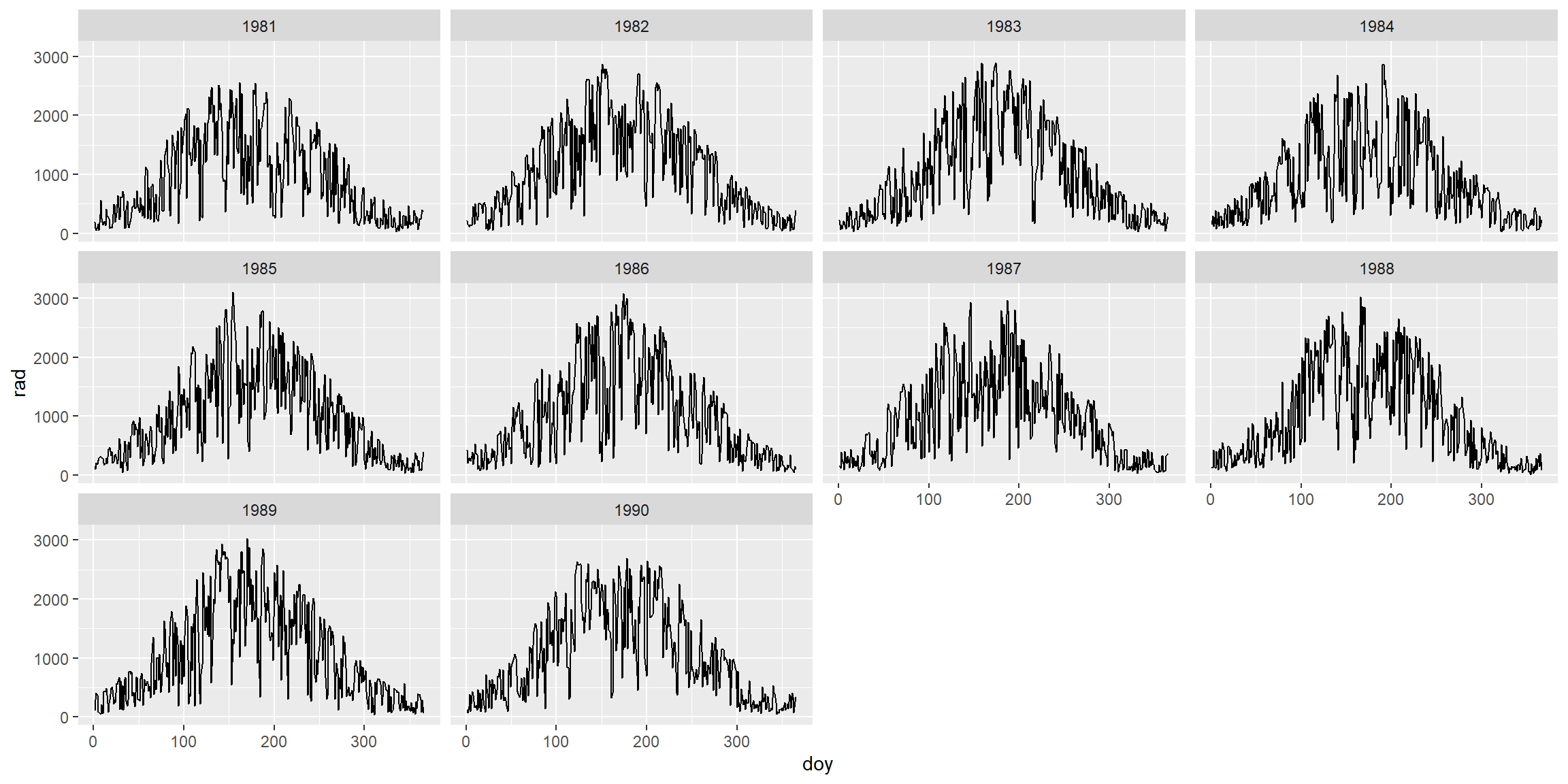
Example: Solar Radiation Data in Dresden
radiation <- read.csv("../data/radiation.csv")
radiation$Date <- as.Date(radiation$date)plot(radiation$Date, radiation$rad)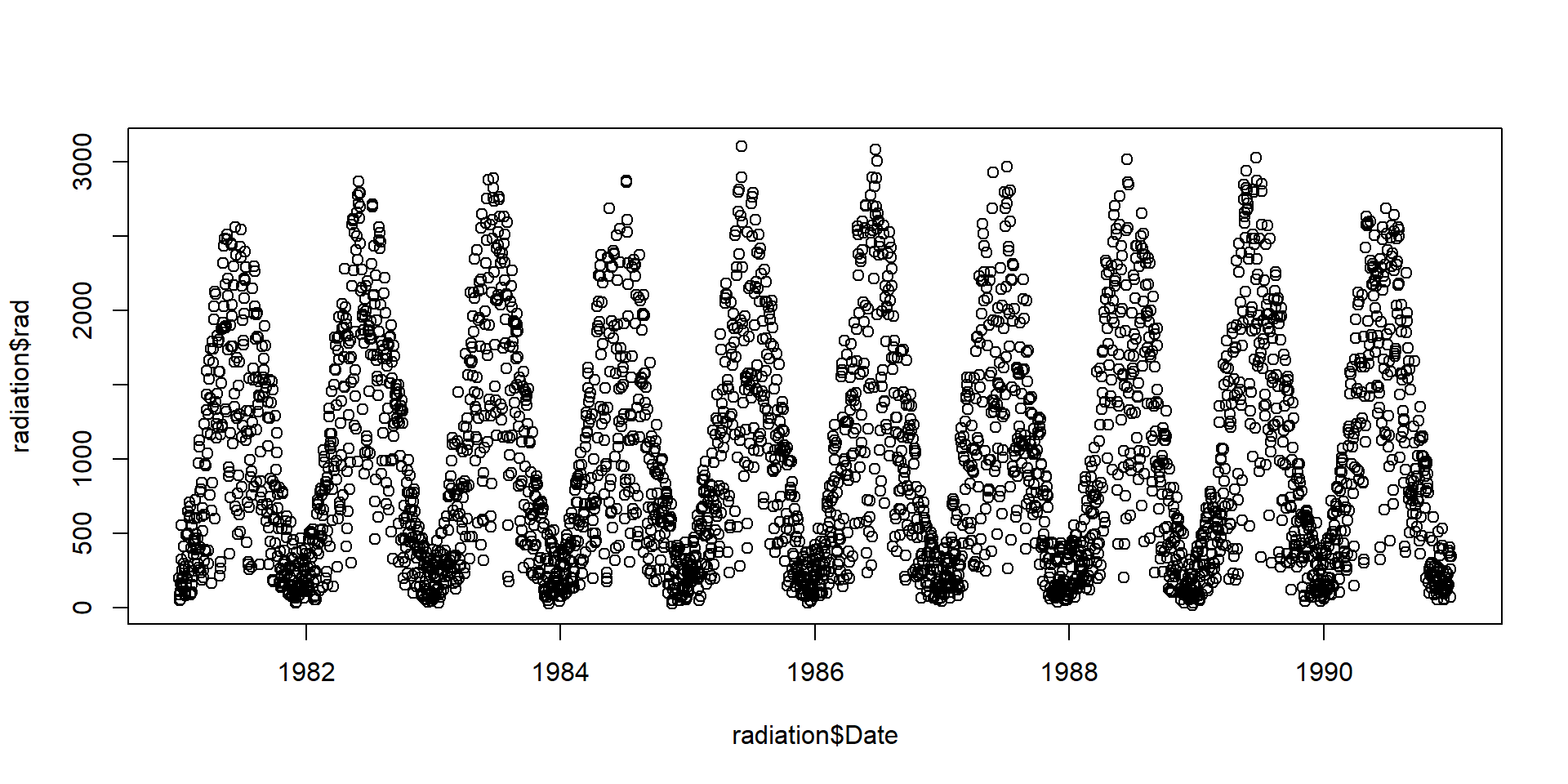
Note: The data set contains derived data from the German Weather Service (http://www.dwd.de), station Dresden. Missing data were interpolated.
Plot aggregated radiation data
par(mfrow=c(1,2), las=1)
boxplot(rad ~ year, data = radiation)
boxplot(rad ~ month, data = radiation)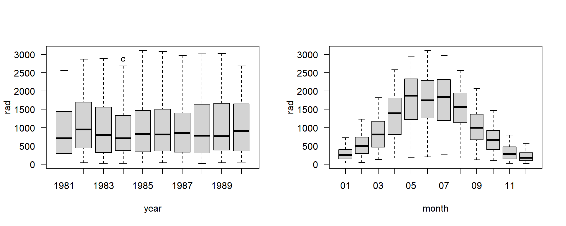
Most functions that support a formula argument (containing ~) allow to specify the data frame with a data argument.
Base Graphics
x <- rnorm(100)
par(mfrow=c(2,2))
plot(x)
hist(x)
qqnorm(x)
boxplot(x)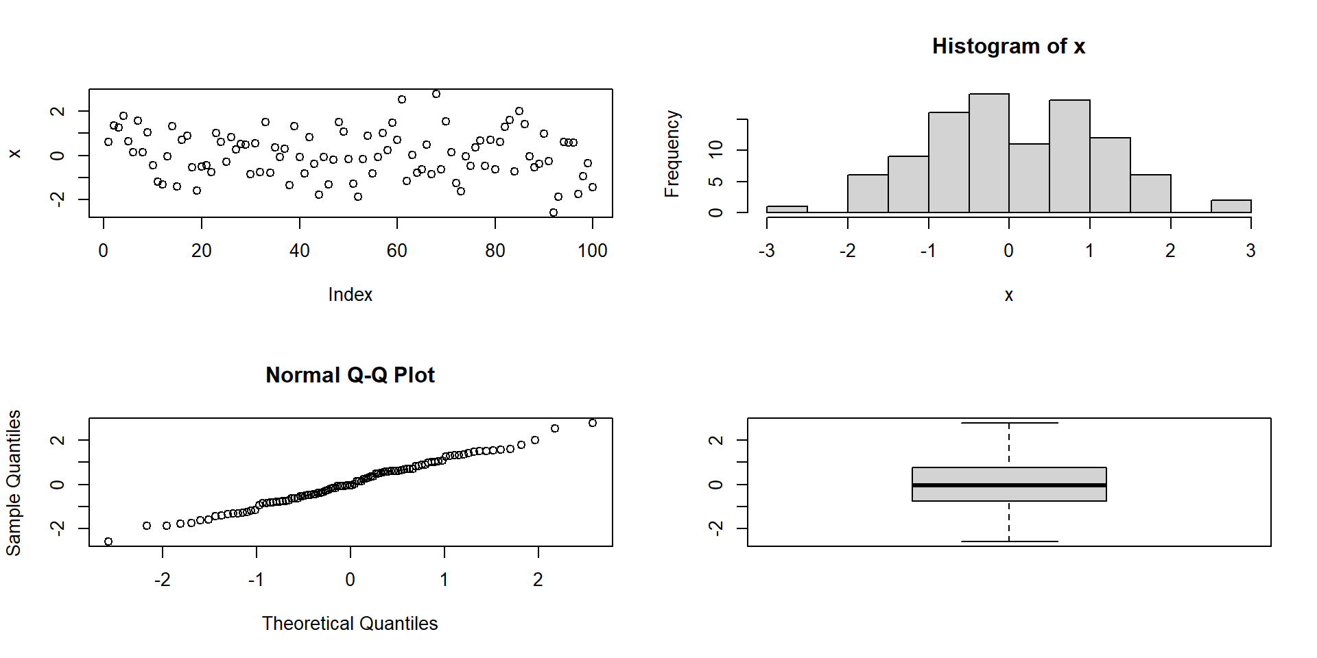
grid and gridBase
- complete freedom to organise plotting area
- interface relatively raw
- basis of other plotting packages
![gridBase image]()
Lattice Graphics
- Implements “trellis graphics” (i.e. gridded graphics) in R
- Sarkar, D. (2008). Lattice: multivariate data visualization with R. Springer Science & Business Media.
require(lattice)
data(iris)
xyplot(Sepal.Length ~ Sepal.Width|Species, data=iris, layout=c(3,1))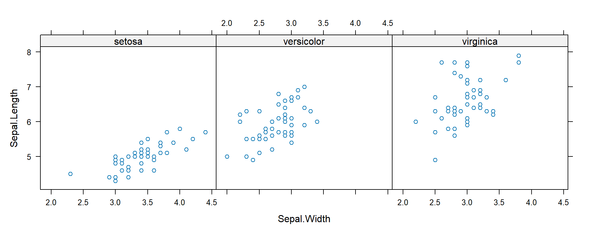
ggplot-Example
library(ggplot2)
data(iris)
ggplot(iris, aes(Sepal.Length, Sepal.Width, color = factor(Species))) +
  geom_point() +
  stat_smooth(method = "lm")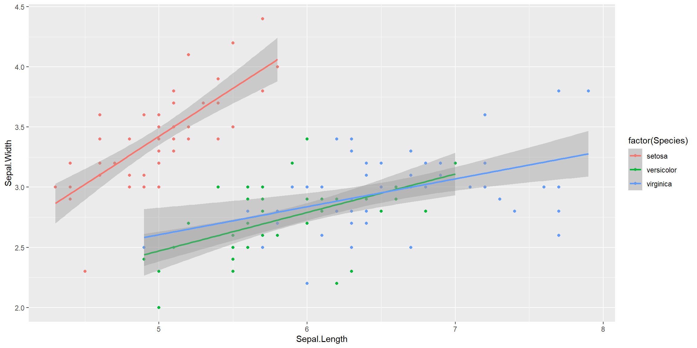
Pipelines and faceting in ggplot2
library("dplyr")
library("lubridate")
library("ggplot2")
read.csv("../data/radiation.csv") |>
  mutate(year=year(date), doy=yday(date)) |>
  ggplot(aes(doy, rad)) + geom_line() + facet_wrap(. ~ year)