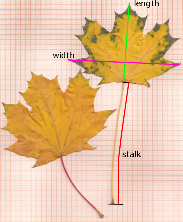
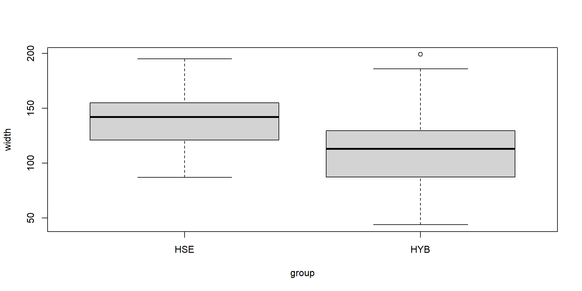
    group                 no             length           width
 Length:126         Min.   :  1.00   Min.   : 37.00   Min.   : 44.0
 Class :character   1st Qu.: 32.25   1st Qu.: 72.00   1st Qu.: 96.0
 Mode  :character   Median : 63.50   Median : 90.00   Median :118.5
                    Mean   : 63.50   Mean   : 95.83   Mean   :117.4
                    3rd Qu.: 94.75   3rd Qu.:102.00   3rd Qu.:138.5
                    Max.   :126.00   Max.   :250.00   Max.   :199.0
     stalk
 Min.   : 29.00
 1st Qu.: 62.00
 Median : 82.00
 Mean   : 81.89
 3rd Qu.:101.00
 Max.   :175.00
Long data formats are more database like and more flexible.
If you are used to working with LibeOffiice or Excel, you will probably prefer “wide” tables that fit well on the computer screen. However, this is not such a good idea for data bases and scripted data science.
Modern data analysis packages like dplyr and ggplot2 mandatorily require the long format.
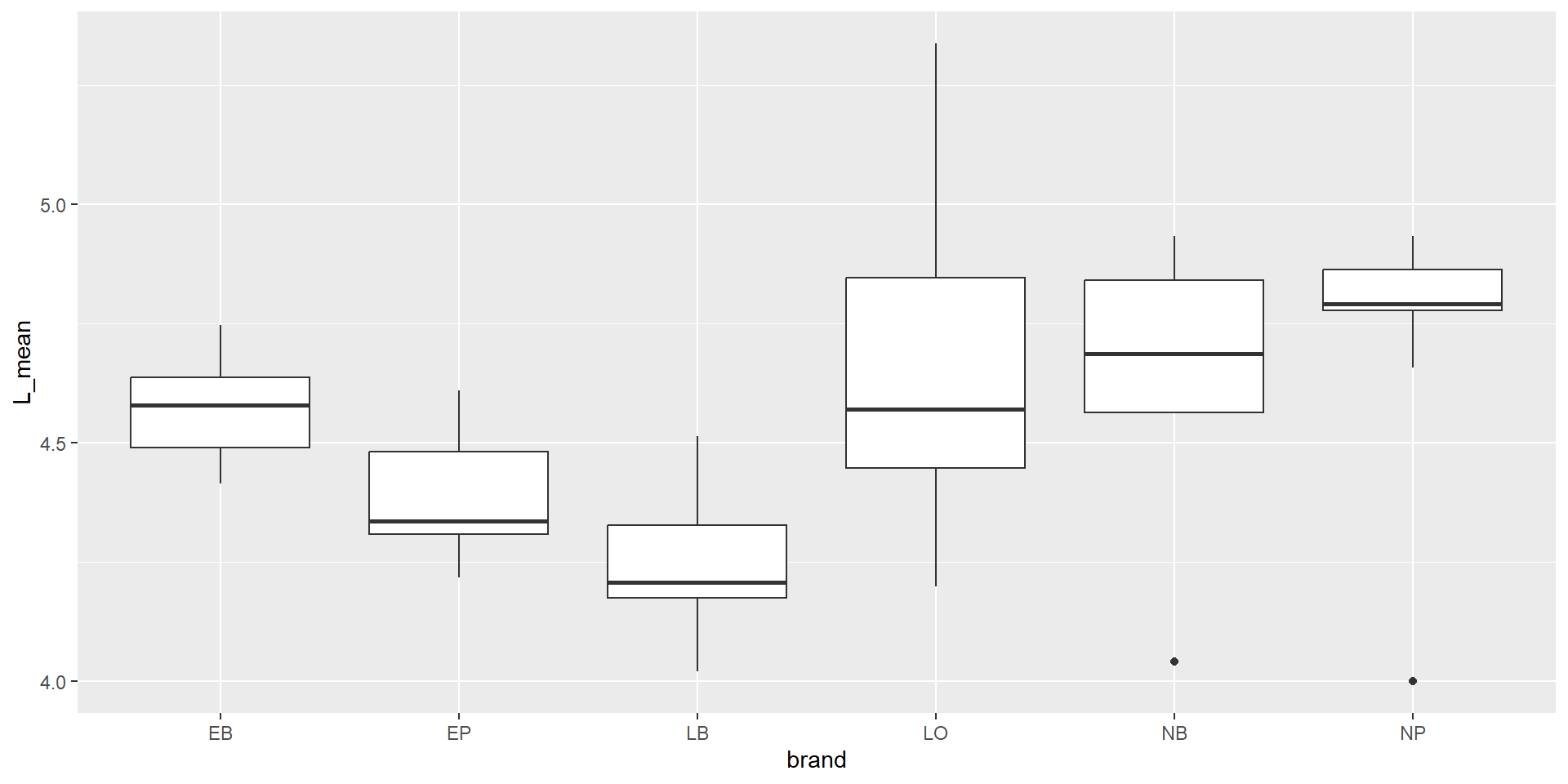
Long data format (= tidy format)
Put data from all 3 variables in one column: length, width, stalk\(\rightarrow\)value
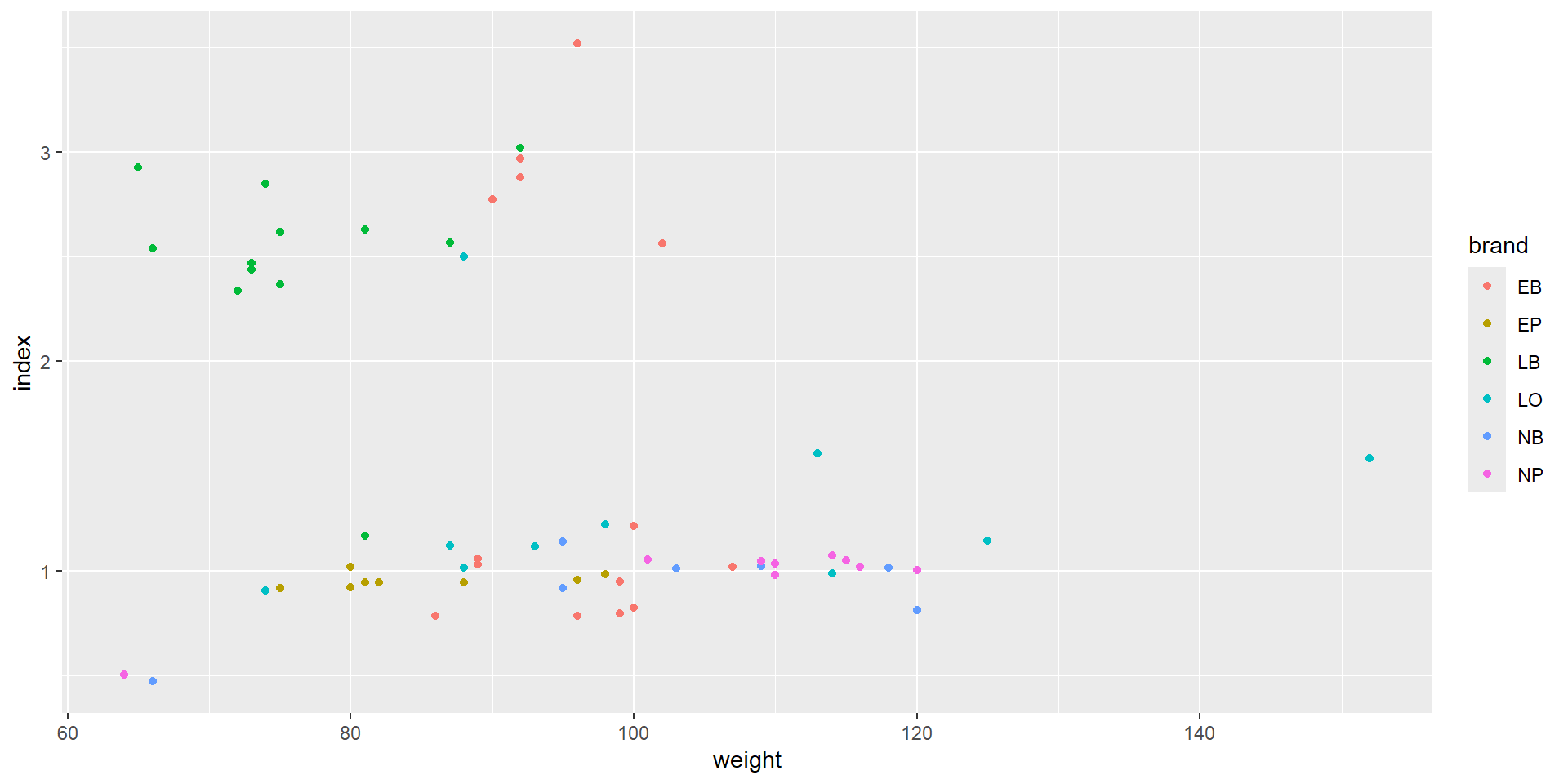
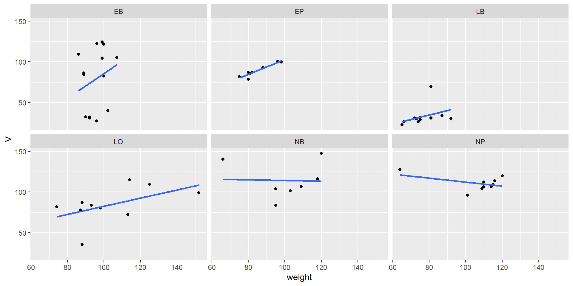
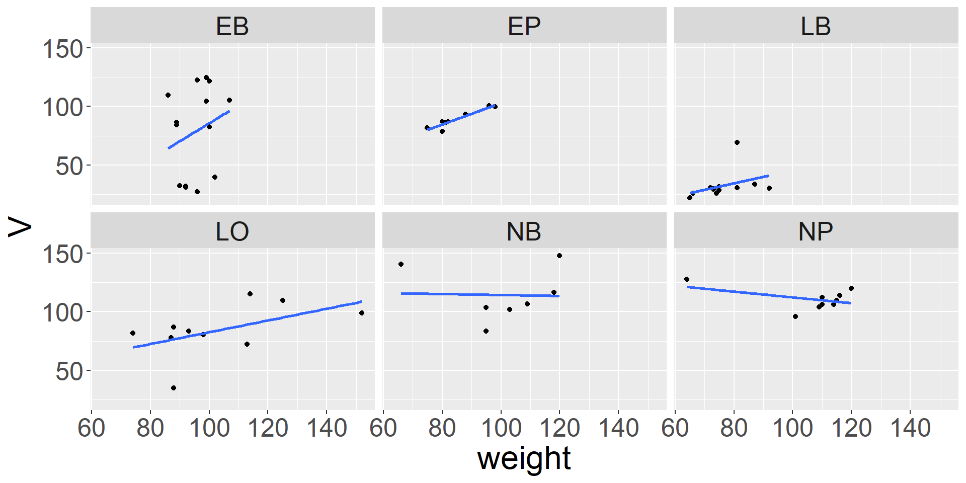
Let’s compare the measured weight of our fruits with a “theoretical volume” calculated from length and height using the formula of an ellipsoid. This is of course an approximation:
\(\rightarrow\)themes allow to configure “almost everything” …
Discharge of the Elbe River
Elbe River in Dresden 2006-04-01
Read data to R
The example file elbe.csv contains daily discharge of the Elbe River in \(\mathrm{m^3 s^{-1}}\) from gauging station Dresden, river km 55.6. The data are from the Federal Waterways and Shipping Administration (WSV) and where provided by the Federal Institute for Hydrology (BfG).
We can skip downloading and read the file directly from its internet location:
The third column “validated” indicate whether the values were finally approved by WSV and BfG. Data of the 19th century are particularly uncertain. Please consult the file elbe_info.txt for details.
Date and time conversion
Now, let’s extend the elbe data frame by adding information about the day, month, year and day of year. Here function mutate adds additional columns.
Note also that the day of year function in the date and time package lubridate is named yday.
Details about date and time conversion can be found in the lubridate cheatsheet.
library(lubridate) # a tidyverse package for dateselbe <-mutate(elbe,date =as.POSIXct(date),day =day(date), month =month(date), year =year(date), doy =yday(date))
Inspect data structure
If we work with RStudio, may have a look at the “Global Environment” pane and inspect the data structure of the elbe data frame.
date
discharge
validated
day
month
year
doy
1989-01-01
765
TRUE
1
1
1989
1
1989-01-02
713
TRUE
2
1
1989
2
1989-01-03
684
TRUE
3
1
1989
3
1989-01-04
612
TRUE
4
1
1989
4
1989-01-05
565
TRUE
5
1
1989
5
1989-01-06
519
TRUE
6
1
1989
6
1989-01-07
522
TRUE
7
1
1989
7
1989-01-08
524
TRUE
8
1
1989
8
1989-01-09
544
TRUE
9
1
1989
9
1989-01-10
539
TRUE
10
1
1989
10
1989-01-11
606
TRUE
11
1
1989
11
1989-01-12
606
TRUE
12
1
1989
12
Annual summary statistics
Summarize data
## calculate annual mean, minimum, maximumtotals <- elbe |>group_by(year) |>summarize(mean =mean(discharge), min =min(discharge), max =max(discharge))
Show table of summary statistics
head(totals)
# A tibble: 6 × 4
   year  mean   min   max
  <dbl> <dbl> <dbl> <dbl>
1  1989  268.   122   765
2  1990  217.    89   885
3  1991  189.    97   634
4  1992  267.    89  1090
5  1993  256.    92  1610
6  1994  317.    92  1030
Exercise: Compute monthly discharge mean values and monthly sums.
More about pivot tables
In a section before, we already used pivot_longer to reorganize data. Now we do the opposite and convert a data base table (long data format) into a cross-table (wide data format) and vice versa.
R provides several function pairs for this, so you may see functions like melt and cast or gather and spread.
Recently the two functions pivot_wider and pivot_longer were recommended for this purpose.
The first argument is a data base table, the other arguments define the structure of the desired crosstable.
id_cols is the name of a column in a long table that will become the rows
names_from indicates where the names of the columns are taken from
values_from is the column with the values for the cross table.
\(\rightarrow\) If more than one value exists for a row x column combination, an optional aggregation function values_fn can be given.
Then create a crosstable for monthly maximum discharge over all years.
Back-conversion of a crosstable into a data base table
The inverse case is also possible, e.g. the conversion of a cross table into a data base table. It can be done with the function pivot_longer. The column of the id.vars variable(s) will become identifier(s) downwards.
elbe |>mutate(doy =yday(date)) |>group_by(doy) |>summarize(max =max(discharge), mean =mean(discharge), min =min(discharge)) |>pivot_longer(cols =c("min", "mean", "max"), names_to ="statistic", values_to ="discharge") |>ggplot(aes(doy, discharge, color = statistic)) +geom_line()
Exercise
Read the code and try to understand it. Then add a dry and a wet year.
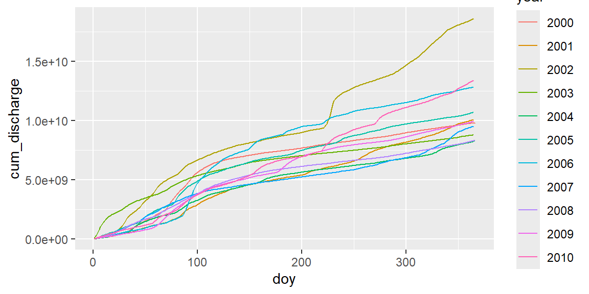
Cumulative sums
Annual cumulative sum plots are a hydrological standard tool used by reservoir managers. We can use the R function cumsum, that by successive cumulation converts a sequence of:
Cummulative sums allow to detect dry and wet years, or periods within years.
If we just use cumsum, we get a cumulative sum for all years:
elbe |>mutate(doy =yday(date), year =year(date)) |>filter(year %in%2000:2010) |>group_by(year =factor(year)) |>mutate(cum_discharge =cumsum(discharge) *60*60*24) |>ggplot(aes(doy, cum_discharge, color = year)) +geom_line()
The multiplication with \(60 \cdot 60 \cdot 24\) converts \(\rm m^3 s^{-1}\) in \(\rm m^3 d^{-1}\).
Exercises
Repeat the same for other time periods (years).
Which year was the wettest, which one the driest year in total? Find a year with dry spring and wet summer.
Identify some (e.g. 3 or 5) large floods in the historical time series and plot it together.
Modify the commands so that the hydrological year is shown. Note that the German hydrological year goes from 1st November to 31st October of the following year. Other countries have different regulations.